Sea to Summit Case Study, Part 1
Sheena Schleicher
SEO STRATEGY | SHOPIFY SEO | SITE ARCHITECTURE OVERHAUL
Sea to Summit is a global adventure lifestyle brand in the outdoor industry, inventing gear that enables freedom and self-reliance in any environment.
As a referral from a different client (our most common source of new business), Sea to Summit partnered with Schleicher Marketing to support the brand’s US team with SEO strategy on the Shopify+ ecommerce website serving the North American market: www.seatosummitusa.com. We’ll share about the international domain and global website migration to www.seatosummit.com in Project Phase 2 next. Our key contact was quite experienced with SEO, so the efficiencies and results were swift!
The Challenge: Site Architecture + Navigation Overhaul
One of the first things our team identified was the need to improve the site’s architecture to better serve Sea to Summit’s key audiences and support the SEO strategy.
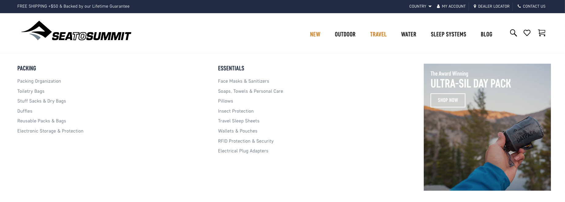
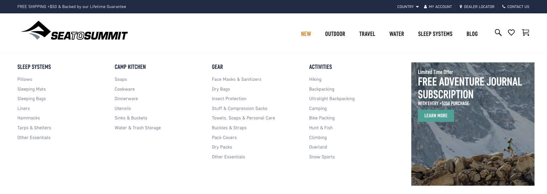
The existing global navigation was not intuitive with its naming convention, offered the same products across multiple collection pages, was not informed by SEO-minded research, and was cumbersome for the Sea to Summit team to manage.
The Solution: Clarity Through Intentional Categorization
We collaborated with the Sea to Summit team to properly organize, categorize, and merchandise the brand’s expansive product offerings. And we asked questions that brought clarity not just to us, but to brand teams who needed an outside perspective.
We provided low-fidelity wireframes and high-fidelity designs to present the recommended structure and to prompt design. We made edits to wireframes in real-time during collaborative team meetings (with screen-share and video on) to ensure we got everything just right.
The Result: User AND SEO Friendly Architecture
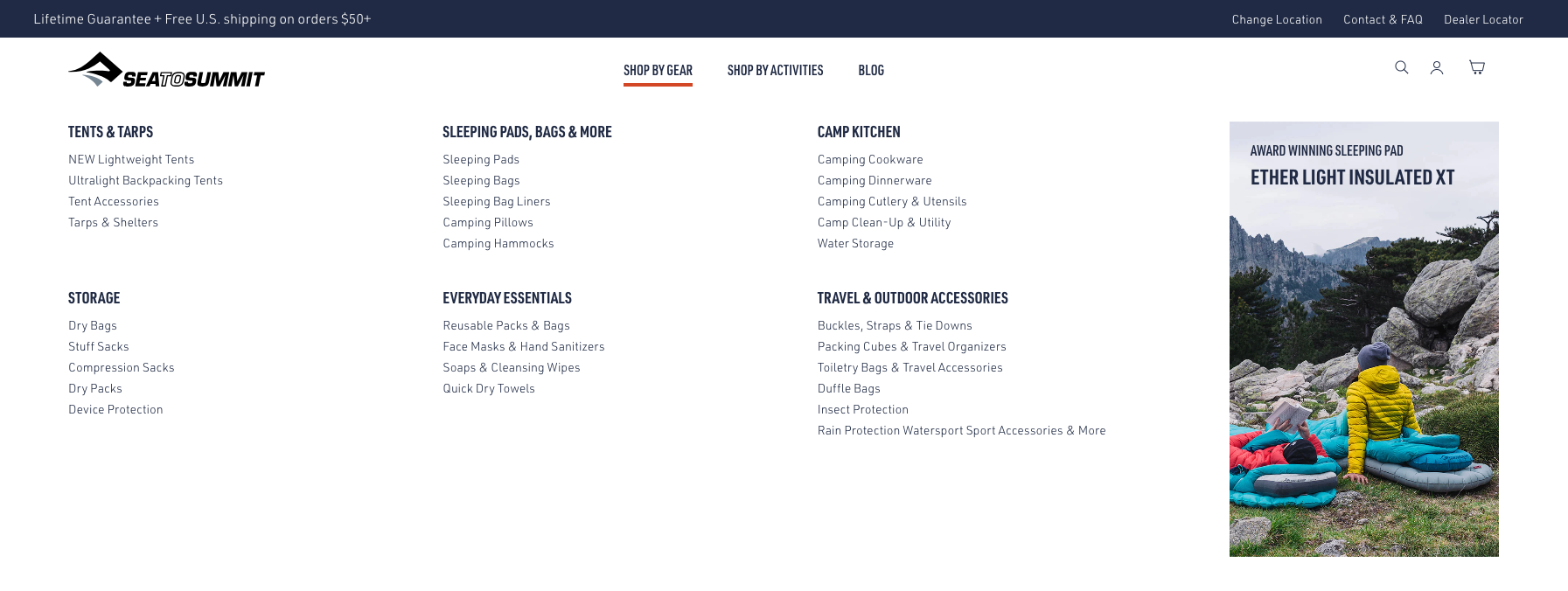
The finished product was a fresh website architecture and navigation structured for the best possible user-experience and that supported the brand’s SEO strategy. The effort had the added benefit of streamlining internal product merchandising and page management. This is the way to do it.
With the site architecture and navigation reworked to be user- and SEO-friendly, we rolled the on-site SEO tactics, elements, and techniques that were brand-aligned and audience-centric without any hiccups.
We worked with brand-side development resources to implement dynamic SEO elements across thousands of pages. We collaborated with the brand’s marketing team to ensure the new product catalog included SEO-informed product naming conventions and for new categories to be properly organized and merchandised within the new site architecture and navigation. We became part of the brand’s planning and review process to ensure all on-site efforts aligned with the brand’s SEO strategy and to leverage every opportunity to teach and empower in-house teams on SEO concepts that work.
Our partnership with Sea to Summit started in December 2020, with the new SEO-informed site architecture and page-level SEO elements rolling out in early January 2021. The improvements garnered immediate and lasting results:
Simpler and more efficient product management and merchandising for the Sea to Summit ecommerce team
More intuitive naming conventions and organization for improved user experience
Optimized internal link structure that signaled to Google what the site’s most important pages and how each page is related (page hierarchy)
Increased organic search visibility (aka Keyword Rankings) and site visitors
After a few months of working with the US team on the North America website, we were invited to be the SEO strategy partner for the brand’s international multi-domain migration and website launch project.
See how we supported Sea to Summit in expanding their ecommerce offerings to new regions with a multi-domain approach that supports the business and its key audience while meeting all the needs on the SEO front.


